I came to expect more from you as you launched later collections...

Honestly, when I first saw this collection last year with names inspired by NYC itself (SoHo, Times Square, Penn Station, Chinatown), I was just not that excited. The colors were blahh (except one). The formula was outright awful, ranging from streaky, watery to chipping the next day.
Even when this cheap polish is on sale, it's still not worth it :(
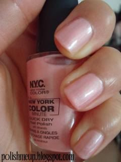
222B SOHO - a princess pink pearl (3 coats)
Pros: Love love love this color. Not overly cool-tone. A tad darker than OPI Bubblebath which is a favorite of mine.
Cons: The most watery of the batch. Hard to get an even application (tell me I just got a bad bottle)

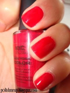
224B TIMES SQUARE - Bright coral (going into red) creme (2 coats)
My camera has a habit of making reds more orange than they really are. I had high hopes for this colour but our relationship just didn't work out.

230B PENN STATION - Cherry red with red shimmer
Super appropriate for xmas which is the only time I wear it =P

210B CHINATOWN - Grey-blue ink shimmer
If you're reading my colour description and asking what? That's right. This was the only unique shade in the entire collection...

If you're on a budget, I still wouldn't recommend you buy these BUT if you're a colorholic, definitely check out Chinatown. Soho makes a nice alternative to OPI Bubblebath (I'm not saying it's a dupe so don't be confused).

No comments:
Post a Comment